![[The Transformers Archive - an international fan site]](/common/skin/cardbackwide/tfarchive.png)


Opinions needed please =)
-
slartibartfast

- Posts: 1895
- Joined: Sun Sep 03, 2006 11:40 pm
- Location: paris.
- Contact:
-
Cliffjumper
- Posts: 32206
- Joined: Wed Jan 31, 2001 5:00 am
-
inflatable dalek

- Posts: 24000
- Joined: Sat Apr 03, 2004 3:15 pm
- Location: Kidderminster UK

-
Cliffjumper
- Posts: 32206
- Joined: Wed Jan 31, 2001 5:00 am
-
slartibartfast
- Posts: 1895
- Joined: Sun Sep 03, 2006 11:40 pm
- Location: paris.
- Contact:
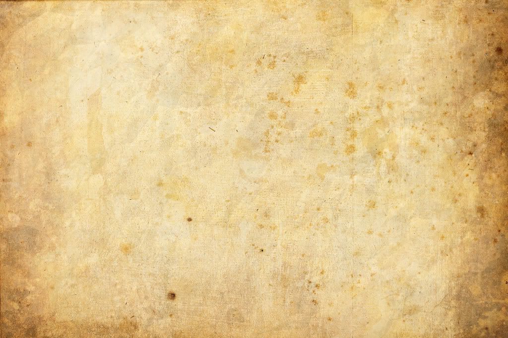
For white on black, you could go for a gothic parchment, or burned paper vibe.
http://i256.photobucket.com/albums/hh16 ... _paper.jpg
http://i256.photobucket.com/albums/hh16 ... _paper.jpg
To slightly amend a quote from someone: bad designers copy, good ones steal.Cliffjumper wrote:I just can't think of one without just half-inching someone else's
Pretty much all of mine have been half-inched from elsewhere; by the time they're actually implemented, you'd be hard-pressed to recognise the roots.
-
Cliffjumper
- Posts: 32206
- Joined: Wed Jan 31, 2001 5:00 am
One thing I might tinker with is table background... as pretty much any page I've updated recently uses a table, I could use a specific sub-scheme for a table in the middle of a page, making the bulk of the text dark-on-light, but keeping the overall feel the same (and saving me redoing lots of paintaking graphics and working out various other solutions). Hmmm... something like... http://counter-x.net/sandbox/maybe.html - or does that just look too much like I don't have a clue what I'm doing? Obviously there'll only be a limited number of background colours that aren't distracting...
TBH, aside from this place, I've not seen a massive amount of web-layouts I find particularly appealing... the main other site I've always like dthe look of is F1 Rejects... which, erm, the domain appears to have expired on yesterday But for general text layout, think the above, but split into paragraph 'blocks'...
TBH, aside from this place, I've not seen a massive amount of web-layouts I find particularly appealing... the main other site I've always like dthe look of is F1 Rejects... which, erm, the domain appears to have expired on yesterday
-
slartibartfast
- Posts: 1895
- Joined: Sun Sep 03, 2006 11:40 pm
- Location: paris.
- Contact:
-
Cliffjumper
- Posts: 32206
- Joined: Wed Jan 31, 2001 5:00 am
Yeh, next one lighter does seem a little bright - http://counter-x.net/maybe2.html - I'll probably change the link colours to something with a bit more contrast with the background (possibly even just black, letting the underlining do the work).
That's growing on me, y'know. Gives me an excuse to use tables constantly as well. I mean, I do anyway, but now there's an excuse beyond borderline computer illiteracy...
EDIT: Damn, changing the link colour changes the ones at the top of the page... though actually, I'm not that sure I need them... They'd need overhauling anyway, the logo takes people back to the index... I dunno, anyone else use links like that?
-
slartibartfast
- Posts: 1895
- Joined: Sun Sep 03, 2006 11:40 pm
- Location: paris.
- Contact:
Compared, I'd go for the darker too, although it can seem a bit dingy after a while. Minor gripe.Cliffjumper wrote:http://counter-x.net/sandbox/maybe2.html
I use the top banner if I want to look for something else, it's just as quick as the links underneath.
-
Cliffjumper
- Posts: 32206
- Joined: Wed Jan 31, 2001 5:00 am
Yeh, I think I'll junk them all... 12 along the top would be hella unwieldly anyway, possibly not wrap. Back buttons (mental note: change to buttons) and homepage link should be enough 
Latest fiddle of the index: http://counter-x.net/sandbox/front.html - if I'm going for colour, might as well do full colour rather than slightly faded. The only bit I have reservations about is the Convertors button, but then material's so low... maybe extreme close-up of a figure?
Latest fiddle of the index: http://counter-x.net/sandbox/front.html - if I'm going for colour, might as well do full colour rather than slightly faded. The only bit I have reservations about is the Convertors button, but then material's so low... maybe extreme close-up of a figure?

To answer the opening post, I'd go with the color version simply due to it being more eye-catching than the grayscale version. With the color version, I can clearly make out the Gobots, Transformers, Linkits, Legos, and Voltron logos instantly whereas the B&W version takes another second or two to realize what I'm looking at. I'd also go with a dark background since I've found white ones to be harder on my eyes even with the contrast and brightness on my computer set to really, really low values.
Thanks, Zeeks! Great job!

-
Cliffjumper
- Posts: 32206
- Joined: Wed Jan 31, 2001 5:00 am
I should probably mention now that I've pretty much gone with the colour 
I love the look of monochrome, but the practicality - at least the way I have it laid out - was not so good. The buttons were in for a total redesign (the font-based ones suffer the problem that the words have to shrink for something like "Transformers" compared to, say, "Lightan", whereas at least this way the non-uniform look looks intentional) anyway, and using logos doesn't tend to work as well in b&w.
And I'm just going to mention here that I hate the Gobots logo. It's the wrong shape, it's ****ing difficult to cut around, and it makes everyone think there's a damn hyphen in it).
-
Cliffjumper
- Posts: 32206
- Joined: Wed Jan 31, 2001 5:00 am
I can't tell you whats on her site as I'm too poor to pay for a membership, and honestly have never paid for a membership to any site of that sort, and can't really ever see myself doing so. I can vouch its damn hard to find any clips of her online though, I was bored as hell last night (wife started a new night job) and was looking for some to ease the boredom, found only 3 low quality video clips by chance.
