![[The Transformers Archive - an international fan site]](/common/skin/cardbackwide/tfarchive.png)


Pat lees character proportions
-
Lambda prime

- Protoform
- Posts: 1137
- Joined: Sat May 24, 2003 7:08 am
- Location: North East UK
- Contact:
Pat lees character proportions
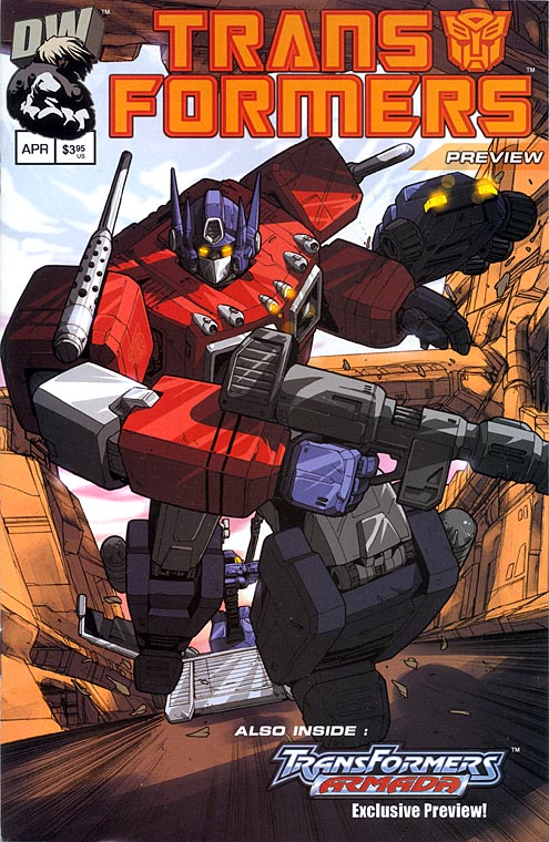
Pat lee's Transformers were okay in Dreamwaves first Mini-series, the team gave the comic a animated epic feel with the colouring, but i felt that some of his characters were wrong it was his depiction of Devastator and Superion in issues 4 and 5. They were far too big, they should both be twice the size of the taller Transformers such as Optimus, soundwave and Megatron, not five times. Anyone see any others they didnt like?
-
Dead Man Wade

- Posts: 4890
- Joined: Wed Jul 16, 2003 8:15 pm
- Location: Funny location
-
Ballplayer
- Protoform
- Posts: 269
- Joined: Thu Apr 03, 2003 3:20 pm


-
Ballplayer
- Protoform
- Posts: 269
- Joined: Thu Apr 03, 2003 3:20 pm
This "giant" depiction of the Gestalts could kind of emphasize the danger that the humans were in, or it could also show the humans' fear of the Transformers. If you saw a robot that was a hundred feet tall, you would be really scared. But, imagine if the robot was the size of "Godzilla!", that certainly would seem more frightening. Maybe that sort of adds a realistic twist to the fear of the humans in the comic?


-
Cliffjumper
- Posts: 32206
- Joined: Wed Jan 31, 2001 5:00 am
-
Ballplayer
- Protoform
- Posts: 269
- Joined: Thu Apr 03, 2003 3:20 pm
-
Streetwise
- Protoform
- Posts: 86
- Joined: Sat Sep 21, 2002 11:39 am
\Originally posted by Ballplayer
I have to say, volume one looked better than volume 2
I don't know if the artist changed, what I do like is that with overview's almost no generic robots are used.
Pat Lee is still the artist.
The matrix is no mere weapon! No simple energy source! It is POWER! Ultimate, unfathomable power! --- Scourge (The burden hardest to bear)
-
Cliffjumper
- Posts: 32206
- Joined: Wed Jan 31, 2001 5:00 am
With his white tits, oversized legs, emotionless face and the worst version of the Op truck cab since some **** at Takara or Hasbro designed the cab for PM Prime [or Ginrai... I really couldn't care much less which version came first...]... Oooookay. I suppose your idea of a bad rendering of Prime would be Geoff Senior's one in UK #98 then?
It's opposites land! Hot snow falls up!
At least I assume that's what's going on... or is all this praise of Pat irony I just haven't tapped into?
It's opposites land! Hot snow falls up!
At least I assume that's what's going on... or is all this praise of Pat irony I just haven't tapped into?
-
CounterPunch
- Protoform
- Posts: 3394
- Joined: Wed Jan 02, 2002 5:00 am
- Location: What?
- Contact:
i dont see a problem with pats artwork, its not the best tf official comic artist but he is by far not the worst, for that i look to jose delbo (i was going to say frank springer who did the original 4 part miniseries right but i decided not to cos it can be excused as "its a miniseries to promote toys so who the hell cares how i draw")
i'd say i like this volume better than volume 1.
i'd say i like this volume better than volume 1.
I second that. At least Lee was consistent and has matched Prime's cab mode to his robot mode, as compared to the weird Goldbug discrepancies in MTMTE #2...Originally posted by Cliffjumper
the worst version of the Op truck cab since
Still, the cab looks just plain awful. And MUCH worse than PM Prime!!!!
Looking for a complete Energon Sky Shadow (from Superion Maximus).
Offering: Binaltech Hound, Swindle, Ravage (Corvette), Skids.
Can buy in stores: Robot Heroes Tigatron/Inferno, Ricochet/Predaking.
Offering: Binaltech Hound, Swindle, Ravage (Corvette), Skids.
Can buy in stores: Robot Heroes Tigatron/Inferno, Ricochet/Predaking.
-
Cliffjumper
- Posts: 32206
- Joined: Wed Jan 31, 2001 5:00 am
An obviously messy production process [the clear uncertainty over character models, the blatant "inserts" with Shockwave] led to most of the art problems in the first Marvel mini... but the Delbo is worse than Lee argument really is a dire one, you know. Hey, that North Korean chappy, he's actually okay, as Saddam's a much bigger prick, right? It also helps Pat that by running the company he can take as long on a book as he likes, and having Adobe Photoshop doesn't hurt... That said, all the boffo-socko technology and DW's brave stand at refusing to bring a comic out in the same quarter as the month mentioned on the cover comes to ****-all when so far they've given us a re-run of The key to Vector Sigma Pt. 2 segued with War of the Dinobots, and followed it up with a 3rd-rate fanfic...Originally posted by CounterPunch
i dont see a problem with pats artwork, its not the best tf official comic artist but he is by far not the worst, for that i look to jose delbo (i was going to say frank springer who did the original 4 part miniseries right but i decided not to cos it can be excused as "its a miniseries to promote toys so who the hell cares how i draw")
And Nevermore, Goldbug's art in MTMTE was horrid! I agree! How can a VW, with blatant VW parts on the robot mode, have absolutely no curved parts? Lots of the MTMTE artwork really hasn't been up to scratch, especially some of the "triangle" car modes [Fizzle, for one...].
Originally posted by Cliffjumper
And Nevermore, Goldbug's art in MTMTE was horrid! I agree! How can a VW, with blatant VW parts on the robot mode, have absolutely no curved parts?
Aside from the fact that the Marvel version of Goldbug wasn't any less bulky
Hey! I confess! I'm one of the few Goldbug fans out there! Why not have Goldbug (whom most people seem to ditch in favor of his former self) become the New Beetle model (which Bumblebee fans seem to ditch in favor of the old bug) instead? That way, everyone would be happy.
Originally posted by Blitzwing
I think the 'inflatableness' of the characters is also a result of Dreamwave's coloring. Pat draws them kind of plump, but the colors make them look like balloons. Forget lasers, they should fire thumb tacs at each other.
I think not. This looks like a robot made of shiny metal. This looks like a giant inflatable beach toy.
Looking for a complete Energon Sky Shadow (from Superion Maximus).
Offering: Binaltech Hound, Swindle, Ravage (Corvette), Skids.
Can buy in stores: Robot Heroes Tigatron/Inferno, Ricochet/Predaking.
Offering: Binaltech Hound, Swindle, Ravage (Corvette), Skids.
Can buy in stores: Robot Heroes Tigatron/Inferno, Ricochet/Predaking.
-
CounterPunch
- Protoform
- Posts: 3394
- Joined: Wed Jan 02, 2002 5:00 am
- Location: What?
- Contact:
Originally posted by Cliffjumper
An obviously messy production process [the clear uncertainty over character models, the blatant "inserts" with Shockwave] led to most of the art problems in the first Marvel mini... but the Delbo is worse than Lee argument really is a dire one, you know. Hey, that North Korean chappy, he's actually okay, as Saddam's a much bigger prick, right? It also helps Pat that by running the company he can take as long on a book as he likes, and having Adobe Photoshop doesn't hurt... That said, all the boffo-socko technology and DW's brave stand at refusing to bring a comic out in the same quarter as the month mentioned on the cover comes to ****-all when so far they've given us a re-run of The key to Vector Sigma Pt. 2 segued with War of the Dinobots, and followed it up with a 3rd-rate fanfic...
And Nevermore, Goldbug's art in MTMTE was horrid! I agree! How can a VW, with blatant VW parts on the robot mode, have absolutely no curved parts? Lots of the MTMTE artwork really hasn't been up to scratch, especially some of the "triangle" car modes [Fizzle, for one...].
just wondering what that has to do with my original post, i dont see how the argument of lees art vs. delbos art is dire. as we are talking about their art.... nothing else.