![[The Transformers Archive - an international fan site]](/common/skin/cardbackwide/tfarchive.png)


Isnt his one of the late entries (what happened there Slarti?)
I find myself once more loving the work of Andrew Griffiths tho I have not looked at the Hunter ones yet Ive looked at almost all the work in the other 3 and its definitely my favourite.
IDW cover contest | UPDATE: final results now in!
-
martyboy70

- Posts: 1613
- Joined: Mon Sep 11, 2006 10:25 pm
- Location: Glasgow,Scotland
Loss of job. Will sell for food here.

-
slartibartfast

- Posts: 1895
- Joined: Sun Sep 03, 2006 11:40 pm
- Location: paris.
- Contact:
I lost about two kilos during that week through general lack of sleep and lack of sunlight though, and I almost lost my job. Epic.
-
Housewife2000

- Protoform
- Posts: 70
- Joined: Wed Nov 01, 2006 10:07 pm
- Location: London
- Contact:
AskShockwave - cheers man! I'm a big fan of your style, particularly the details, like Hook's eyes and his reading lens. Deceptichops' piece looks like something from Dante's Inferno.
Slarti - that's a damn shame because your sense of design and layout is amazing.
By the way, does anyone know if it's the top two places in each category, or just the one winner who goes through to round three?
Slarti - that's a damn shame because your sense of design and layout is amazing.
By the way, does anyone know if it's the top two places in each category, or just the one winner who goes through to round three?
-
slartibartfast
- Posts: 1895
- Joined: Sun Sep 03, 2006 11:40 pm
- Location: paris.
- Contact:
Yay ! new freebox ! Looks exactly like the old one, only with less dust !
results of round two are up : http://idwpublishing.com/phpBB2/viewtop ... &start=624
I haven't been following, so I'm not sure what that's all about. Sounds juicy.
edit : @housewife2000 : thanks for your encouragement dude. I really like your way of thinking in your work. There's definately a niche for your style. Top-notch artwork too.
much later edit : christ, I meant to say the same thing about Askshockwaves' work too. That sounds lame but I mean it.
...a week without the internet and I've forgotten how it works..
even later much later edit : innocently pimping my work, here is marissa.08(final).svg
-
AskShockwave

- Protoform
- Posts: 88
- Joined: Sun Sep 09, 2007 8:08 am
- Contact:
yo yo. Controversial change of result on the Arkeville thread. Well, maybe not controversial, but, it's a change. I'd link but I'm lazy.
Once again, Slarti - the cover i wish I'd drawn. That you didn't get it in on time makes me chew my fist, there's nothing as unique as that in the whole comp, period.
Does this mean all the tfarchivers are out?
Once again, Slarti - the cover i wish I'd drawn. That you didn't get it in on time makes me chew my fist, there's nothing as unique as that in the whole comp, period.
Does this mean all the tfarchivers are out?
"There's money in the Banana Stand"
Think so. It was tough to not just pick most of them out this time around... doubt there'll be landslide wins in round three.
Yeah, the arms are a nice touch, as is the blaster-blowing and the chap flinging himself off at the right. It'd make a sweet pinup piece... the 'Cons seemed a bit superfluous, though, and I couldn't work out what Swindle was doing with the cannisters. Probably something obvious, like I missed the fact the Doc still has fingers on his artificial arm...@housewife2000 : thanks for your encouragement dude. I really like your way of thinking in your work. There's definately a niche for your style. Top-notch artwork too.
-
slartibartfast
- Posts: 1895
- Joined: Sun Sep 03, 2006 11:40 pm
- Location: paris.
- Contact:
Thanks dude. Yeh, my general reluctance in finishing projects has caused me strife in the past as well. The competition was as much a test of my own confidence as well as a test of artistic skill. Getting comfortable with letting things go takes some getting used to... 

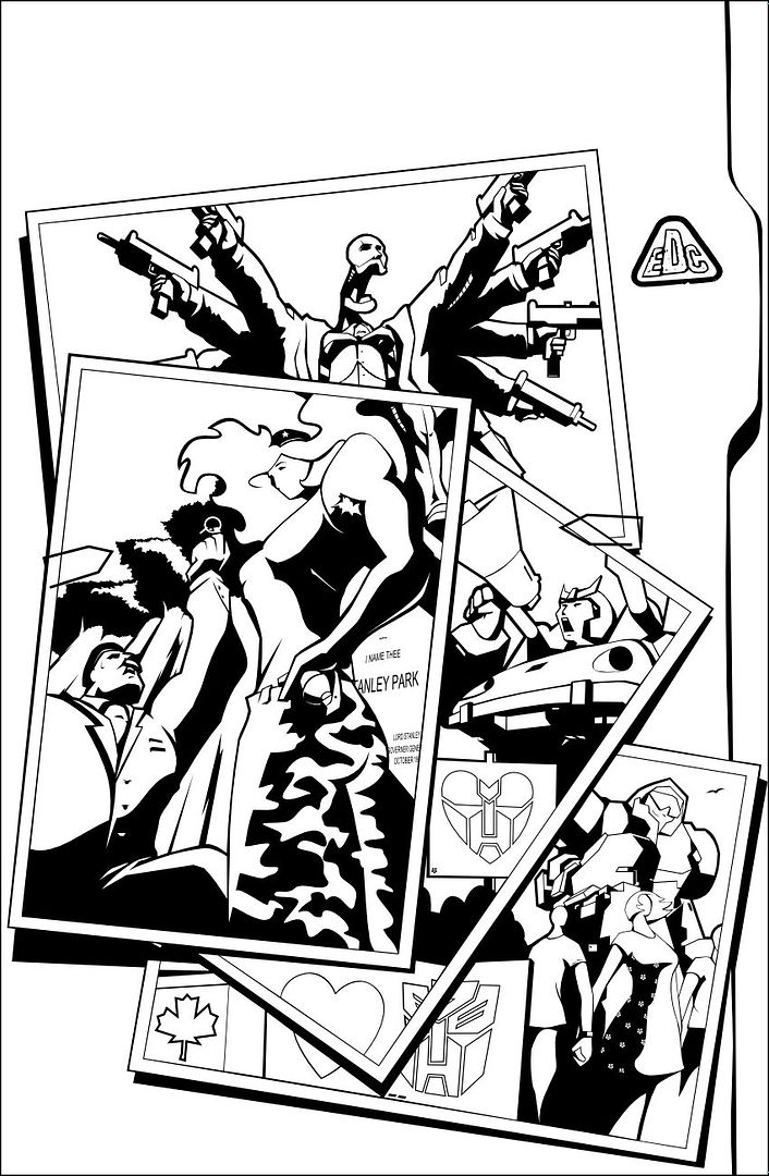
Da official graduates of round two :
Spotlight : Circuit breaker
Casey Coller & Ozzy Fernandez


Spotlight : Doctor Arkeville
Joana Amaral & Dylan Gibson


Spotlight : Hunter O'nion
Evan Gauntt & D.J. Bryant


Spotlight : Marissa Fairbourne
Andrew Griffith & Christie Majors


Play at home graduates :
Aric Huftles & Tim Shinn


I hope that's right. Wonderful stuff across the board. Looking forward to the play-at-home proposition(s) for round three.... Gonna hand that shit in on time, this time 'round Spotlight : Circuit breaker
Casey Coller & Ozzy Fernandez


Spotlight : Doctor Arkeville
Joana Amaral & Dylan Gibson


Spotlight : Hunter O'nion
Evan Gauntt & D.J. Bryant


Spotlight : Marissa Fairbourne
Andrew Griffith & Christie Majors


Play at home graduates :
Aric Huftles & Tim Shinn


-
polystyleneman
- Protoform
- Posts: 3
- Joined: Thu Feb 07, 2008 9:30 pm

For Round 2 winners, You should post people's Round 1 winning entries beside their Round 2 ones, just for fun.slartibartfast wrote:Thanks dude. Yeh, my general reluctance in finishing projects has caused me strife in the past as well. The competition was as much a test of my own confidence as well as a test of artistic skill. Getting comfortable with letting things go takes some getting used to...
Da official graduates of round two :
-
slartibartfast
- Posts: 1895
- Joined: Sun Sep 03, 2006 11:40 pm
- Location: paris.
- Contact:
Good call. Seeing the evolution in everyones' work would be fascinating.
Although maybe wait until round three, for a fully blown retrospective-type-thing ?
edit : err, sorry, forgot to post the results of the play-at-home contest : http://idwpublishing.com/phpBB2/viewtop ... ght=#61012
Although maybe wait until round three, for a fully blown retrospective-type-thing ?
edit : err, sorry, forgot to post the results of the play-at-home contest : http://idwpublishing.com/phpBB2/viewtop ... ght=#61012
-
Housewife2000
- Protoform
- Posts: 70
- Joined: Wed Nov 01, 2006 10:07 pm
- Location: London
- Contact:
The final should be really interesting. I just did a quick compare between the winners 1st and 2nd round entries, and it's clear that everyone upped their game, with better shading, positioning and use of shadows. Good stuff.
Well, you win some you lose some. Back to drawing my own stuff again...
Yeah, once I hitched myself to the Opera House monster idea, the 'cons role was hard to pin down. They've both got welding gear / tools to suggest they've played a hand in constructing the Opera/Monster, but (on reflection) their poses in relation to the piece overall are just too relaxed and need to be more dynamic.Denyer wrote: Yeah, the arms are a nice touch, as is the blaster-blowing and the chap flinging himself off at the right. It'd make a sweet pinup piece... the 'Cons seemed a bit superfluous, though, and I couldn't work out what Swindle was doing with the cannisters. Probably something obvious, like I missed the fact the Doc still has fingers on his artificial arm...
Well, you win some you lose some. Back to drawing my own stuff again...
-
AskShockwave
- Protoform
- Posts: 88
- Joined: Sun Sep 09, 2007 8:08 am
- Contact:
That's one of the best things about illustration, of any kind, imo. It's always really encouraging looking at the stuff strip artists produced when they started out, and what they can produce even a year later.slartibartfast wrote:Good call. Seeing the evolution in everyones' work would be fascinating.
"There's money in the Banana Stand"
-
AskShockwave
- Protoform
- Posts: 88
- Joined: Sun Sep 09, 2007 8:08 am
- Contact:
You ever thought of trying your hand at a mosaiic? Your second round entry had a nice flow to it, it seemed like you were trying to tell a progressive story with just one image. That'd be great to see in moasic, most of which are (not to their detrement or anything) fairly straightforward panel based affairs. I'd love to see Slarti's minimal stylishness in a mosaic - like his comp entries, they'd be a refreshing change.Housewife2000 wrote: Well, you win some you lose some. Back to drawing my own stuff again...
"There's money in the Banana Stand"
-
Housewife2000
- Protoform
- Posts: 70
- Joined: Wed Nov 01, 2006 10:07 pm
- Location: London
- Contact:
I did a Mosaic, way back when - here. To be honest, it was a bit of a rush job, but got me into doing War Journal pages and then this competition, and I'm hoping it's given me enough momentum with drawing that I can carry over to my own work.
I second the need for a Slarti Mosaic! And an AskShockwave Mosiac!
I've written one that still needs an artist if anyone is interested..?
I second the need for a Slarti Mosaic! And an AskShockwave Mosiac!
I've written one that still needs an artist if anyone is interested..?
-
slartibartfast
- Posts: 1895
- Joined: Sun Sep 03, 2006 11:40 pm
- Location: paris.
- Contact:
I remember that one. Great starting point, and you've come in leaps and bounds on top of that.
 - I'd be up for doing a mosaic, only I'm rather busy right now with :
ROUND THREE.
... and the real round three is here : http://idwpublishing.com/phpBB2/viewtopic.php?t=3507
ROUND THREE.
... and the real round three is here : http://idwpublishing.com/phpBB2/viewtopic.php?t=3507
Pro judging of the third and final round --
http://idwpublishing.com/phpBB2/viewtopic.php?p=64966


Yay for wallpaper.
(And doubtless I'll come back to the full thing if I ever pick up a 19" monitor...)
http://idwpublishing.com/phpBB2/viewtopic.php?p=64966


Yay for wallpaper.
(And doubtless I'll come back to the full thing if I ever pick up a 19" monitor...)
-
Cliffjumper
- Posts: 32206
- Joined: Wed Jan 31, 2001 5:00 am
-
AskShockwave
- Protoform
- Posts: 88
- Joined: Sun Sep 09, 2007 8:08 am
- Contact:
It is nifty. Needed to see the larger version he posted on DevArt to get the most out of it --
http://caliber316.deviantart.com/art/ID ... l-80890663
http://caliber316.deviantart.com/art/ID ... l-80890663
Erm? You've lost me...Cliffjumper wrote:Much easier to appreciate his art when it's not set to the worst script ever given official approval, isn't it?

Wow. That looks even better in the larger form.Denyer wrote:It is nifty. Needed to see the larger version he posted on DevArt to get the most out of it --
http://caliber316.deviantart.com/art/ID ... l-80890663
Wonder if we'll ever see a color version...