![[The Transformers Archive - an international fan site]](/common/skin/cardbackwide/tfarchive.png)


I have one major bugbear/concern when coloring my Transformers illustrations (for Generation 1). Namely do I go with the toy color schemes or the cartoon/animated movie schemes.
For example I never really dug Galvatron in the purple hue (a bit too much YMCA for my tastes). Whereas a Megatron Kick A** color scheme of silver and chrome is really nasty and speaks business.
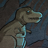
Likewise Grimlock's eye visor looks cool red ala the toy, but the blue (for the Autobots ala the cartoon looks a little non-descript). Although I can see that it does look less threatening I always colored the Dinobots eyes red to give them that edge.
It's just some elements seem a little too non descript like Swoops blue body (I can understand the clash with too much red for the animators) and especially the coneheads (sorry Ramjet, Dirge, Thrust) look REALLY silly with the noses of the fighters not bent back and sticking up. So I've always drawn 'em with the dome or nose cones down.
I might be thinking about all this too much, but I'd love some insigt on what you folks think.
close